Client
Gabriel Civinski
Service
Visual Identity, Naming
Branch
Mentoring / Sales Training
Data
May, 2025

Before Altavenda. Now, a reference.
The old identity no longer accompanied the new moment of the company. The founder no longer felt represented, the name seemed simple, did not convey sophistication, and limited the perception of the brand's value.
The company was born with a clear purpose: to bring scale and predictability to those who sell, especially to those who are currently directionless.
Within the market, we found a pattern: aggressive speeches and clichés. That's when we chose a path of being impactful but without being aggressive. The black and gray build the foundation to give space and highlight the red in a darker tone.
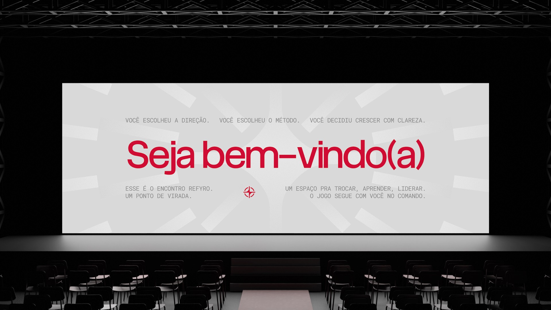
The symbol unites the concept of a target that refers to focus and the pursuit of clear goals, in addition to the compass rose, symbolizing strategy and path. And, as the manifesto says:
In our hands is the compass for those who want to lead. We are strategy, direction, and courage.
The turning point for those who are tired of shooting in the dark. And decided to sell with direction.